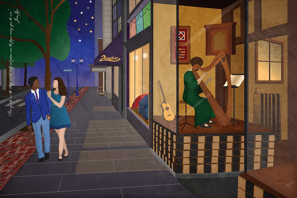
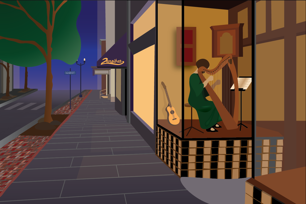
An Evening Stroll
I don't feel like it's an exaggeration to say that this illustration almost killed me. It took forever! Literally, a couple of months. I have included my process in the form of a slide show (see below) so that you can see the creative journey that I took, from the inspiration photo I took last spring to the the completed illustration.
Why create an illustration of my photo?
I loved the composition of my original photo, but it didn't have the drama that I hoped it would have, which was disappointing because there is a be-gowned woman playing a harp in a window at dusk. There were just too many extraneous details, the colors were muted, the random people in my shot weren't dressed up... I could go on.
“But my body was like a harp and her words and gestures were like fingers running upon the wires.”
Bit by by, I recreated the scene in Adobe Illustrator and created the romantic mood I wanted by using texture, choosing dramatic blues and purples for the background to simulate twilight and more whimsical touches like adding stars in the sky and making the leaves in the trees a large amorphous shape.
One of the biggest changes I made was changing the clothing of the people walking by the window. I wanted to dress them up so that I could imagine them having a romantic evening out on the town. They could be coming from a savory dinner at the Pressroom or a play at the Fulton Theatre and stopping for a drink Annie Bailey's because it's just too beautiful of an evening to drive home quite yet...
Wow, for a moment there, I was jealous of the lives my imaginary characters lead.
In any event, let me know what you think! I am planning on making these illustrations of Lancaster a series, so stay tuned for more. If you want to see the first illustration in this series, you can click here.


The Creative Process (Just Shoot Me)
Last month, I stopped at Central Market in Lancaster to pick up some some treats and candy for my family before heading home for the weekend... Continue Reading


Last month, I stopped at Central Market in Lancaster to pick up some some treats and candy for my family before heading home for the weekend. It was a cool, rainy day in April, the beginning of spring. I knew I wanted to pick up some Dark Chocolate Peanut Butter Eggs from The Candy Stand for my mom, Shoofly pie from Wendy Jo’s for my dad, Black Peppercorn cheese from S. Clyde Weaver’s for me, and some Stroopies from Lancaster County Stroopies/ Amish Family Recipes for my sister; my definition of a good morning.
Of course I brought my camera along out of habit. The weather was less than ideal and I was in a hurry, but I knew better than to leave it at home; a classic just-in-case scenario. I was walking quickly into market, the dark sky intermittently spitting rain, when I saw two girls walking down the alleyway with totes, baskets, and umbrellas in hand. Instinctively, I snapped their picture, admiring the composition of the scene more than anything else. Otherwise, the colors were muted and dark, there were tons of extraneous and distracting details in the shot, no detail in the sky and I managed to get a few raindrops on my lens. In short, it was a crap photo.
See the slideshow below to check out the full creative process.
It wasn’t until a few weeks later when I was fiddling around in Lightroom that I came across the shot again. Yup, just as horrible as I remembered except for the composition…. except maybe this wasn’t a throwaway shot, maybe it was a salvage mission. This crappy photograph could be the base of a really cool illustration that I could turn out pretty quickly, or so I thought.
Fast forward four weeks later. The temperature has reached into the eighties, the flower petals are raining down with every gust of wind, and I have finally, finally finished this illustration, thank ye Gods! But after working and staring at this project to the point of burning in it my retinas, just showing you the “Ta-da!” end result seems kind of anticlimactic. Let us revel instead, if you will, in the insane amount of time and attention I have devoted to Rainy Market Day. If only I had spent more time on the title.
For those of you who listen to director commentaries or take the behind the scene tours, this is your lucky day. Continue reading below for the story behind the illustration, Rainy Market Day. I know you want to!
1. The Details: I used Illustrator for the bulk of my design, 90% roughly. My first concern were the details: the bricks in the building, the cobblestones, the rooftops, etc. Ultimately, I decided to stick with the detail in the cobblestone and just use solid colors, gradients and architectural details for the buildings. I wanted the piece to have some texture and depth to it, but I didn’t want the background to feel cluttered or distract from my focal point. Besides which, it would have taken forever! An important part of design are deadlines and time constraints, otherwise designers would work and improve on things for years.
2. The Colors: I realized when I was selecting colors for the background, they were pretty monochromatic. A lot of brown, tan, grays, muted reds. So I knew that I wanted to the make the women, with their the umbrellas, the focal point of the entire piece and adding some spring colors to their parcels, accessories, clothes was a no brainer. I picked yellows, blues, purples, and greens as their color pallet to reference spring and remind the viewer that rainy days give way to blue and sky and tulips and lush green grass, etc.
3. The Women: As for the actual women, I wanted to create characters that looked real in the space. I could have easily found some model shot to use as a reference point, with a cinched waist, flared collar, and high heels, but I wanted to maintain the integrity of the original photograph and the spirit of the illustration which is authentic to Lancaster.
4. The Texture: So for the background texture, I wanted add some energy to the piece and also reference the rain, and general grossness of the day. So I took my completed illustration into Photoshop and using watercolor brushes, created the background. I also really liked the contrast between the soft lines of the watercolor and the unsparing lines of the illustration.
5. The Text and Borders: Finally. I wanted to add a border, something that suited and complimented the illustration without being distracting. My mom is taking a stained glass class right now, and the idea for creating stained glass board germinated from a couple of conversations with her involving her class. Thanks Mom!
I pulled the text from one of the women’s bags. I wanted to keep the “love local” detail because that is sooo Lancaster and the spirit of Central Market, but I wanted it to pop a little bit more. So I pulled it off the bag and essentially added it as a caption, to the top of the illustration. I used a cursive font to keep with the hand-drawn effect.
Ta-Da! This illustration will be for sale in the near future.
Thanks for reading!


