The Creative Process (Just Shoot Me)
Last month, I stopped at Central Market in Lancaster to pick up some some treats and candy for my family before heading home for the weekend... Continue Reading


Last month, I stopped at Central Market in Lancaster to pick up some some treats and candy for my family before heading home for the weekend. It was a cool, rainy day in April, the beginning of spring. I knew I wanted to pick up some Dark Chocolate Peanut Butter Eggs from The Candy Stand for my mom, Shoofly pie from Wendy Jo’s for my dad, Black Peppercorn cheese from S. Clyde Weaver’s for me, and some Stroopies from Lancaster County Stroopies/ Amish Family Recipes for my sister; my definition of a good morning.
Of course I brought my camera along out of habit. The weather was less than ideal and I was in a hurry, but I knew better than to leave it at home; a classic just-in-case scenario. I was walking quickly into market, the dark sky intermittently spitting rain, when I saw two girls walking down the alleyway with totes, baskets, and umbrellas in hand. Instinctively, I snapped their picture, admiring the composition of the scene more than anything else. Otherwise, the colors were muted and dark, there were tons of extraneous and distracting details in the shot, no detail in the sky and I managed to get a few raindrops on my lens. In short, it was a crap photo.
See the slideshow below to check out the full creative process.
It wasn’t until a few weeks later when I was fiddling around in Lightroom that I came across the shot again. Yup, just as horrible as I remembered except for the composition…. except maybe this wasn’t a throwaway shot, maybe it was a salvage mission. This crappy photograph could be the base of a really cool illustration that I could turn out pretty quickly, or so I thought.
Fast forward four weeks later. The temperature has reached into the eighties, the flower petals are raining down with every gust of wind, and I have finally, finally finished this illustration, thank ye Gods! But after working and staring at this project to the point of burning in it my retinas, just showing you the “Ta-da!” end result seems kind of anticlimactic. Let us revel instead, if you will, in the insane amount of time and attention I have devoted to Rainy Market Day. If only I had spent more time on the title.
For those of you who listen to director commentaries or take the behind the scene tours, this is your lucky day. Continue reading below for the story behind the illustration, Rainy Market Day. I know you want to!
1. The Details: I used Illustrator for the bulk of my design, 90% roughly. My first concern were the details: the bricks in the building, the cobblestones, the rooftops, etc. Ultimately, I decided to stick with the detail in the cobblestone and just use solid colors, gradients and architectural details for the buildings. I wanted the piece to have some texture and depth to it, but I didn’t want the background to feel cluttered or distract from my focal point. Besides which, it would have taken forever! An important part of design are deadlines and time constraints, otherwise designers would work and improve on things for years.
2. The Colors: I realized when I was selecting colors for the background, they were pretty monochromatic. A lot of brown, tan, grays, muted reds. So I knew that I wanted to the make the women, with their the umbrellas, the focal point of the entire piece and adding some spring colors to their parcels, accessories, clothes was a no brainer. I picked yellows, blues, purples, and greens as their color pallet to reference spring and remind the viewer that rainy days give way to blue and sky and tulips and lush green grass, etc.
3. The Women: As for the actual women, I wanted to create characters that looked real in the space. I could have easily found some model shot to use as a reference point, with a cinched waist, flared collar, and high heels, but I wanted to maintain the integrity of the original photograph and the spirit of the illustration which is authentic to Lancaster.
4. The Texture: So for the background texture, I wanted add some energy to the piece and also reference the rain, and general grossness of the day. So I took my completed illustration into Photoshop and using watercolor brushes, created the background. I also really liked the contrast between the soft lines of the watercolor and the unsparing lines of the illustration.
5. The Text and Borders: Finally. I wanted to add a border, something that suited and complimented the illustration without being distracting. My mom is taking a stained glass class right now, and the idea for creating stained glass board germinated from a couple of conversations with her involving her class. Thanks Mom!
I pulled the text from one of the women’s bags. I wanted to keep the “love local” detail because that is sooo Lancaster and the spirit of Central Market, but I wanted it to pop a little bit more. So I pulled it off the bag and essentially added it as a caption, to the top of the illustration. I used a cursive font to keep with the hand-drawn effect.
Ta-Da! This illustration will be for sale in the near future.
Thanks for reading!


Hometown Pride
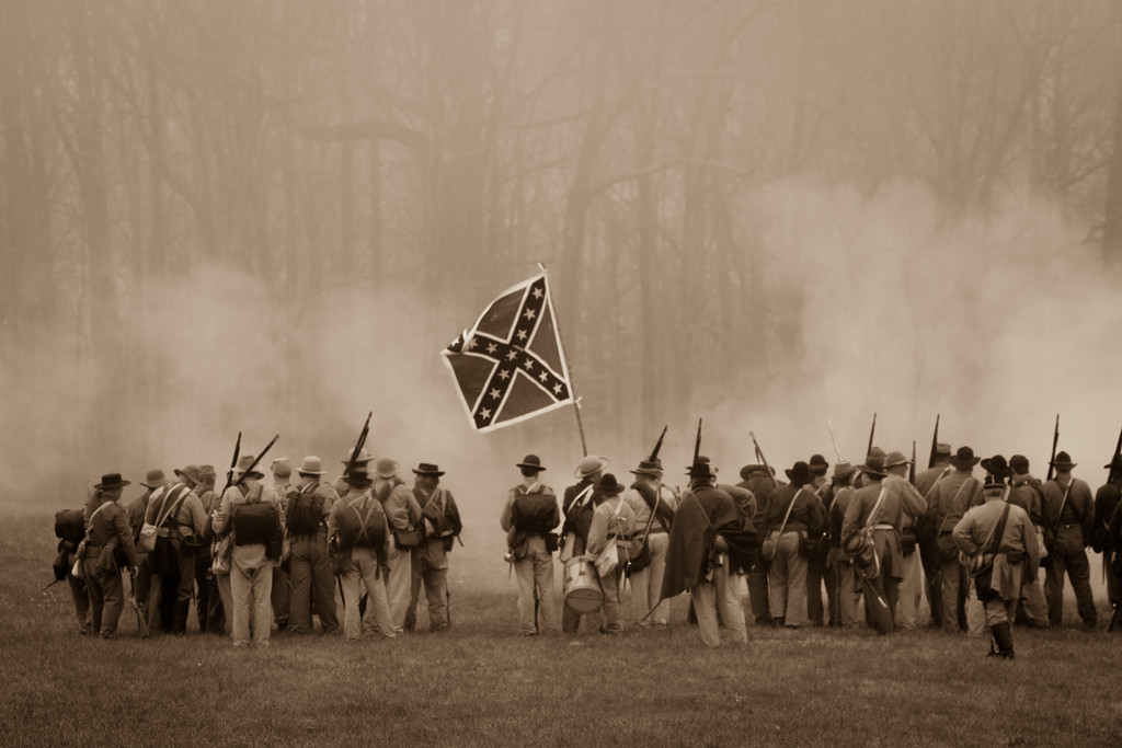
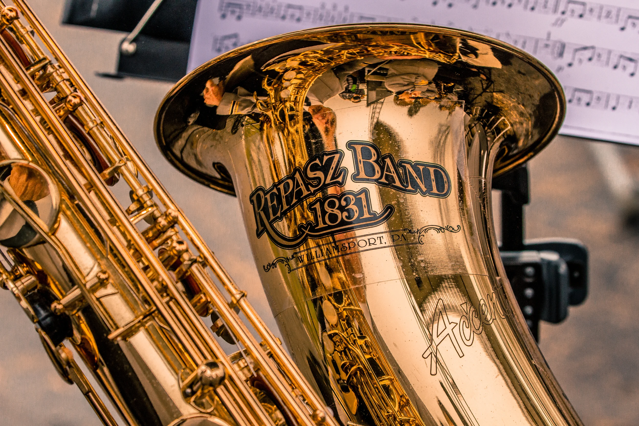
I can relate. I haven’t lived in Williamsport since I was 18, but it’s still where my family and my heart are and a little dose of hometown pride goes a long way. So, when my family asked me if I wanted to drive down to Appomattox, Virginia on April 9th to watch the Williamsport Repasz band perform at the Appomattox Civil War Sesquicentennial ceremony, I said hell yes.
A couple of weeks ago I was watching Friday Night Lights (thank you Netflix) and it was the episode where the character Julie Taylor was rocking her college interview and she had this revelation at the end:
When I started high school, I couldn’t wait to get out of [my hometown]… And now that I’m actually getting close to leaving, I’m starting to appreciate that I was shaped by my town... I guess what I’m trying to say is that– I’m surprised by how happy I am, to be from where I’m from.
I can relate. I haven’t lived in Williamsport since I was 18, but it’s still where my family and my heart are and a little dose of hometown pride goes a long way. So, when my family asked me if I wanted to drive down to Appomattox, Virginia on April 9th to watch the Williamsport Repasz band perform at the Appomattox Civil War Sesquicentennial ceremony, I said hell yes.
Now, why Appomattox you may ask?
Well, here’s a little history lesson for you: Appomattox is the site that bore witness to the end of the Civil War, or at least the beginning thereof, when Robert E. Lee surrendered to Ulysses S. Grant on April 9th, 1865. Both armies were present at the time, one battered and defeated, the other elated and victorious. When the terms of surrender were agreed upon and respective parties shook hands, a Yankee band from Williamsport Pennsylvania in attendance began to play the Star Spangled Banner. Fast forward 150 years, and lo and behold, the band (called the Repasz band) is still in existence and my sister is a clarinet player in the second row. The Repasz band was invited back by the U.S. Department of Interior to play at the ceremony commemorating the watershed moment in our country, and thus the road trip to Appomattox.
Pretty cool, right? You can check out my photos of the Repasz band, the ceremony, and the reenactment below. Enjoy!