Phillips Family Portraits
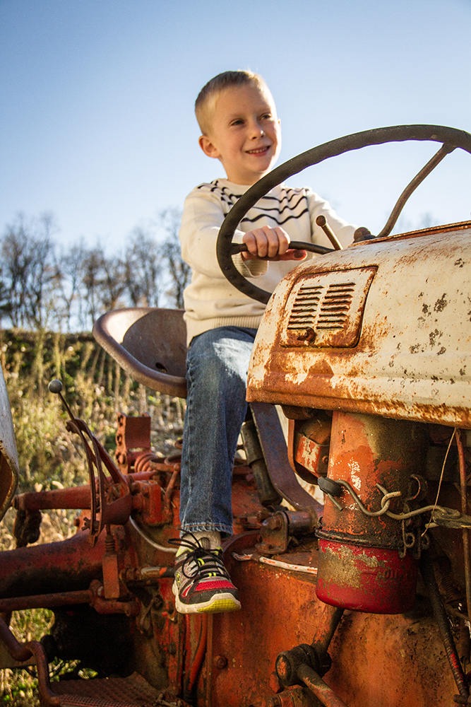
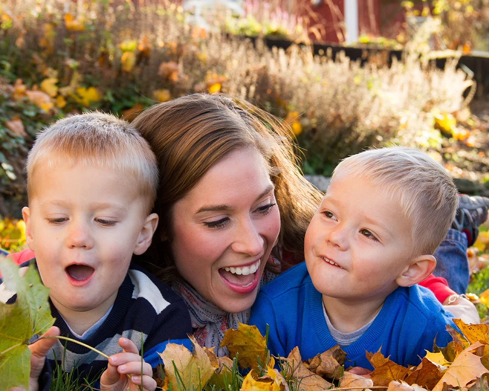
Last fall, I had the pleasure of photographing the Phillipsfamily. I met them at a local farm in Lititz and spent the afternoon chasing three small boys up and down dusty country lanes and through piles of colorful leaves. We had a great time and beautiful weather! The style and feel of the shoot was mostly candid and photo journalistic.
Check out the photos from the shoot below and if you are interested in setting up a family photo shoot of your own, please contact me for pricing and availability. I look forward to hearing from you!
Click on a thumbnail to enlarge and see slideshow
Attention to Detail: Saturday Morning
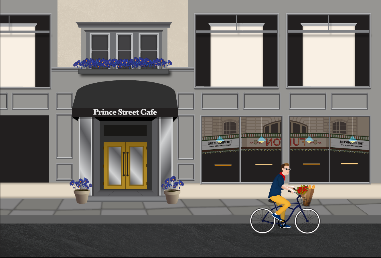
Original photograph that served as basis for the illustration, Saturday Morning Ride.
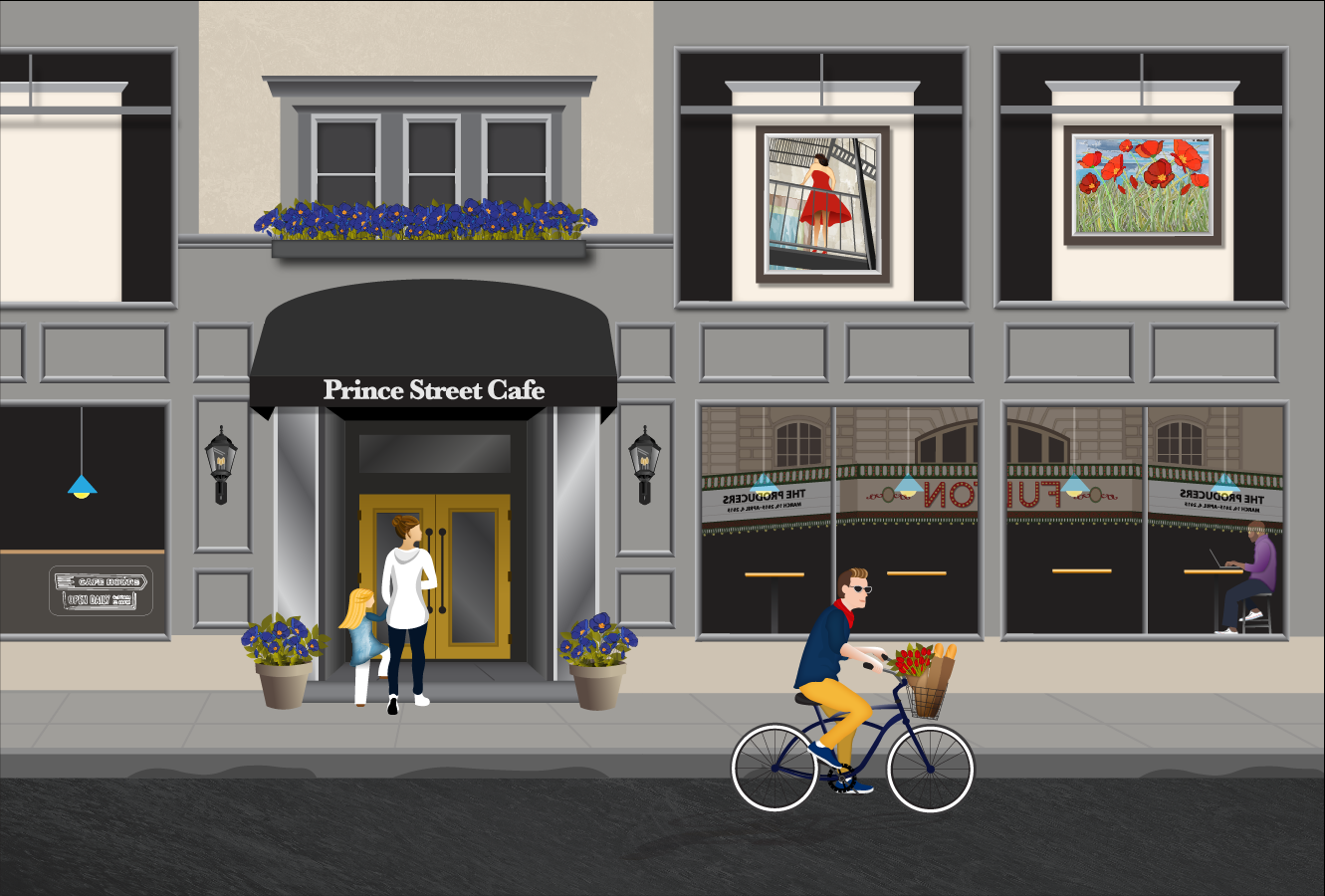
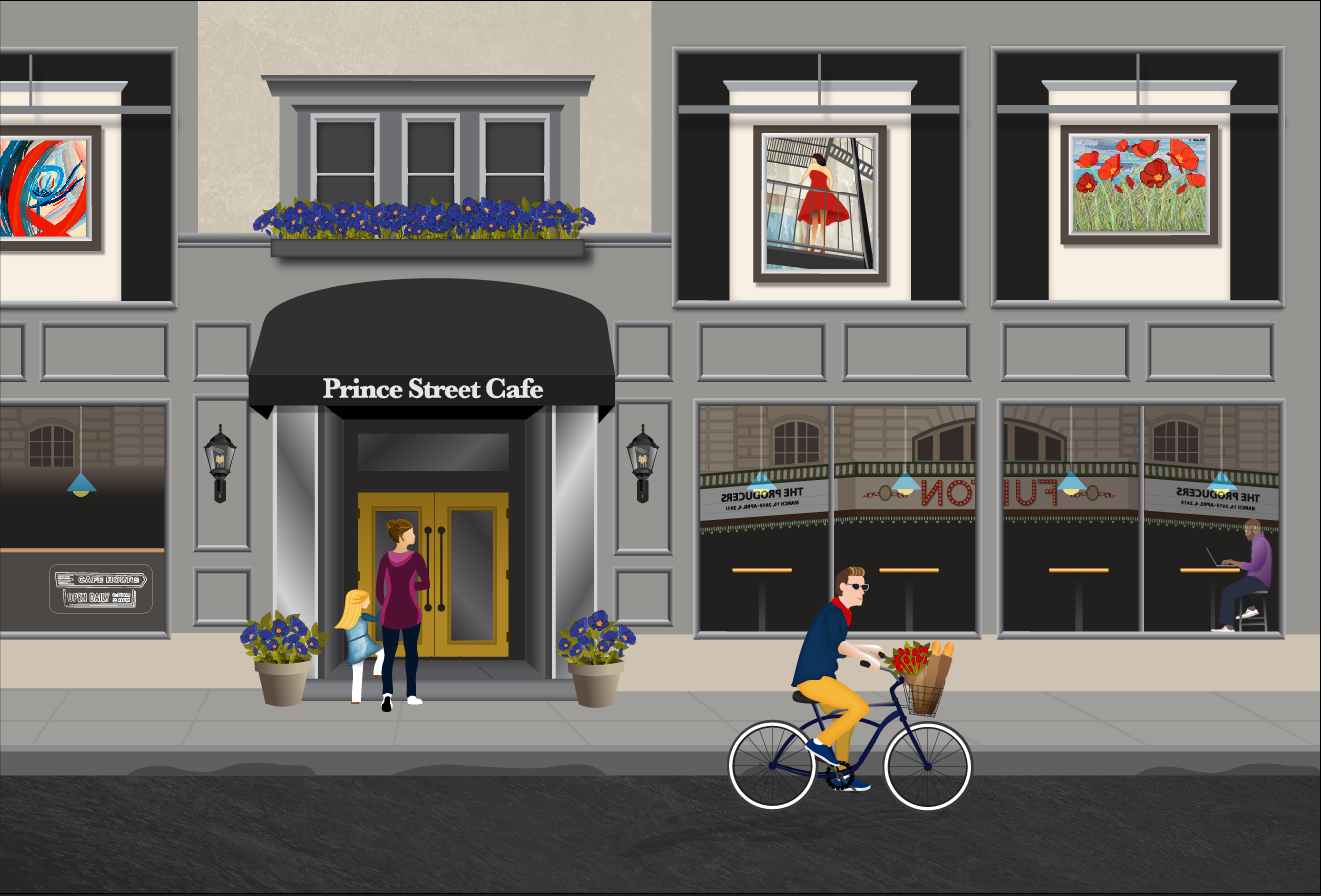
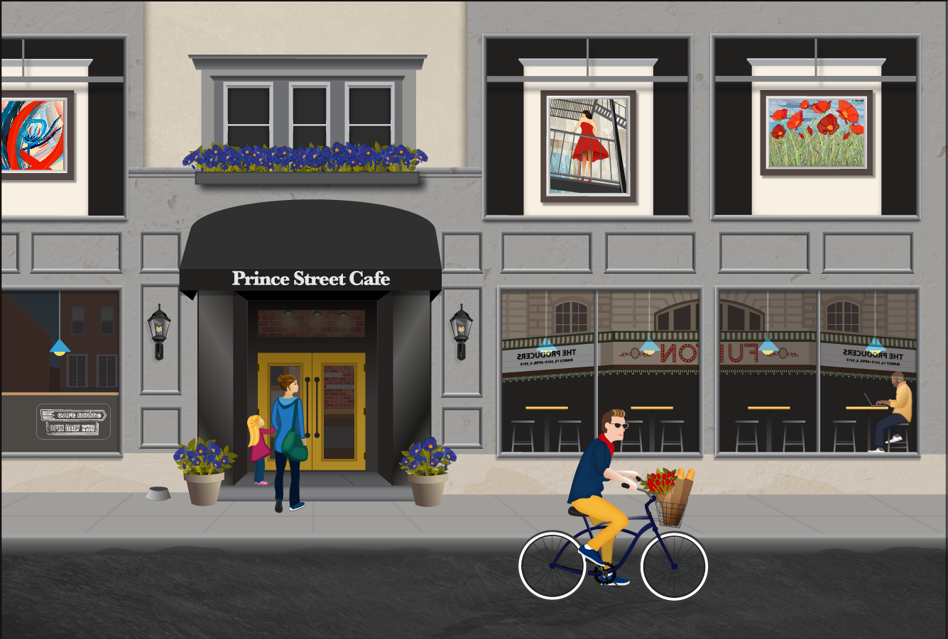
I know what you're thinking– Yay! Another one! Saturday Morning is my latest illustration based on a photograph that I took of the Prince Street Cafe and of the Julia Swartz Gallery last year.
Except this time, it's not exactly true. For Saturday Morning, I used several of my photographs, my knowledge of downtown Lancaster, and online inspiration to create my piece.
How did I keep all of that straight? I created a moodboard.
Moodboard
A Moodboard? Really?
A moodboard is "An arrangement of images, materials, pieces of text, etc., intended to evoke or project a particular style or concept." Think Pinterest. You can make moodboards for your wedding or decorating your house; websites or brand identity projects; or illustrations that keep you up until the wee hours of the morning.
In my case, I had so many ideas and different photographs that I was incorporating into this particular illustration, that I needed a visual space to clear my head and organize my ideas. Trust me– it's not nearly this neat or orderly in my head. So let me break down a couple of elements in my moodboard for you:
Motorcycle vs. Bicyclist - I liked the composition of the photo and originally planned to keep the motorcycle, but it wasn't creating the mood that I wanted: charming and relaxed. I decided to change the motorcyclist to a bicyclist. Not just any bicyclist of course, but the hipster variety: a guy who lives in the city, wears skinny jeans, drinks craft beer, and shops at Market on Saturday morning. I could go on, but you all know that guy, right?
Time of day - I didn't decide what time of day it was until I started drawing the empty basket on the front of the bicycle and decided to fill it. But with what? Prince Street is right in front of Central Market, so hey now (I said to myself) what's more charming than biking over to market on a warm Saturday morning to buy flowers and bread?
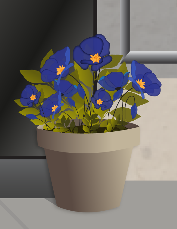
Time of year: Spring - I have had blue poppies on my mind since Longwood Gardens sent me a notification email a couple of weeks ago that they were in bloom. The original Prince Street Cafe photo was taken in December, but I wanted to set the illustration during a season that would give me an opportunity to add more color to the flower pots and and be bicyclist friendly weather. Once I decided on blue Poppies, red Tulips seemed like the perfect compliment and flower to add to the bicyclists' basket.
Color Palette - I drew my initial inspiration from the grey monochromatic color of the exterior of the building and yellow door. I used blue from the poppies and the red from the Fulton sign to round out my color pallete and tie the different elements of my illustration together.
Other patrons - I knew I wanted to include other people in the illustration as well. So 'Guy on a laptop enjoying his morning coffee" seemed like a given, but I also wanted to include a mother and daughter I had photographed during a different visit to the cafe. Since I had already determined that it was Saturday morning, I decided to dress the mother in yoga clothes and be carrying her workout bag. (Note, I am not a Yoga person, but I kind of wish I was) Since she and her daughter started the day off right, they are entitled to a fruit and yogurt parfait and a Blueberry Lemon smoothie at the cafe, am I right?
How did she do that?
You can observe my process through a series of screenshots I captured as I was creating Saturday Morning, in the slideshow below. The slideshow begins with my initial photograph which serves as the base of the illustration and ends with the finished illustration.
God is in the details
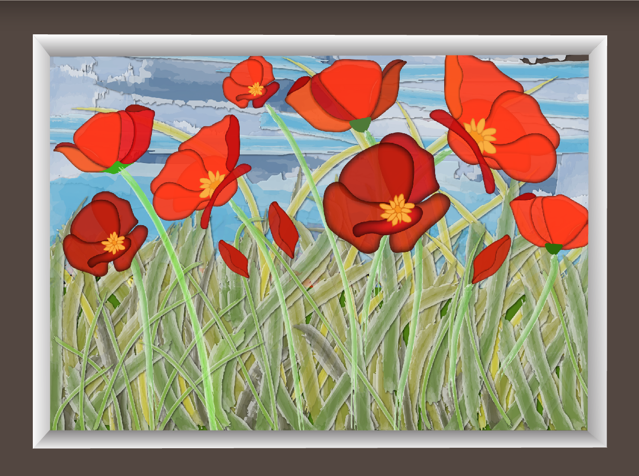
The most fun and the most "arghhhhhhh" parts of these illustrations are the tiny details that really make the illustration substantial and layered. For your enjoyment and benefit, I have zoomed in on some of the finer details that you might not have noticed.
Come see it live!
So on May 6th, I will be co-hosting the opening reception at The Framing Concept for Music for the Eyes with LC Ferrari. I will be showing my illustrations and LC will be showing a series of his photographs. Our work will be hanging at The Framing Concept through the end of May.
You can see more of Lou's work here.
You can see more details about the show here.
Hope to see you there and thanks for reading!


